Collectors can spend years waiting for an Etoupe Birkin – and all with good reason. A Beton Kelly, meanwhile, has the rare ability to anchor an entire wardrobe without ever needing to announce itself.
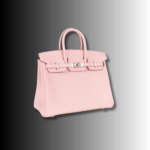
You simply can’t go wrong with neutrals. These shades have a cult following, and we’re not surprised. Here’s a helpful guide to all the Hermès neutral colours you’ll ever need to know about.

Etoupe has been the reigning monarch of the Hermès taupe colour territory, and it’s a mix of grey and brown. It works with literally everything in your wardrobe, whether it’s a charcoal cashmere for the winter or your cream linens for the summertime. It works well with gold and palladium hardware, and nearly never plays favourites.
Etain is a deeper grey with none of Etoupe’s warm-and-fuzzy undertones. It’s a deeper grey that pairs well with palladium hardware, as the cool metal enhances the look. Etain wants to be worn with navy and charcoal.
Nata means cream in Spanish and Portuguese, which gives you everything you need to know about this colour. It’s warm, creamy, and has subtle yellow undertones. It’s not stark white. Nata reads as effortlessly luxurious, the kind of bag you’d pair with an oversized white shirt and rolled-up jeans.
Craie translates to chalk, a chalky, matte-ish white-beige that’s cooler than Nata. While Nata is soft and creamy, Craie is crisp and definitive. This is the white you choose when you want to look pulled-together rather than romantic.
Beton means concrete, but it sounds brutally industrial. This sounds boring, but it’s quite the opposite! It’s the sort of cement-toned beige-grey that’s cooler than a traditional beige, but warmer than pure grey. It’s the perfect balance between modern and timeless.
Beton works with absolutely everything, because it commits to absolutely nothing. In the best possible way.
Gris Tourterelle is a dove grey and it’s the perfect soft, balanced grey that’s neither too warm nor too cool. Gris Tourterlle looks especially stunning in Clemence leather – the soft, slouchy grain of the leather enhances its gentle character.
Gris Perle is a pearl grey but features the faintest hint of blue undertones. It pairs well with silver jewellery and palladium hardware, and pretty much works all year round. It’s quite literally the perfect Hermès grey bag for anyone looking for a grey tone that’s not too dark, nor too light.
Hermès got a little cheeky with the naming here. Gold isn’t the gold metal colour, in fact, it’s a warm, light, tan-beige colour. It’s one of Hermès’ most iconic and long-standing colours and is the perfect gateway neutral.
If you’re looking for a netural colour that’s approachable, warm, classic without being boring, gold rarely disappoints.
Etoupe is a warm taupe colour with brown undertones, yet it has softness and approachability. Under natural light, it’ll look almost like a warm greige colour. It works beautifully with gold and palladium hardware and is the perfect accessory to tie together your brown autumn outfit.
Etain, however, is nothing like Etoupe. It’s a cool, grey-tone taupe that’s borderline charcoal if we’d be so bold. It fits naturally with palladium hardware and complements the perfect winter wardrobe.
Most collectors prefer Etoupe if their wardrobe leans towards warm tones. Etain is great if you prefer cooler tones.
Nata is soft, creamy and warm. It’s got stunning yellow undertones that make it feel summery and romantic. It pairs beautifully with whites, creams, tans and soft greys.
Beton is having none of Nata’s romance. It’s a modern, architectural and cool-toned take on your regular beige-brey colour. Its undertones lean towards grey rather than yellow and it looks stunning in structured Epsom leather, where the leather’s rigidity emphasizes Beton’s clean lines.
Nata if you’re romantic and summer-holiday-inclined. Beton, if you’ve mastered the curated minimalism persona.
Craie is chalk, cooler, crisper, and more structured. It works beautifully with palladium hardware for that cool, editorial aesthetic.
Nata is cream, warmer, softer, and more approachable. It looks gorgeous in Togo or Clemence, where the leather’s natural texture adds dimension.
If you’ve ever described yourself as warm-toned, get Nata. If you know your undertones are cool, Craie is calling.
Gold is warmer, and more traditionally beige. It’s camel-toned with golden undertones that justify its name. It works beautifully with gold hardware and you can easily get away with styling it with browns, camels, creams, and even navy.
Etoupe is deeper and more complex. It’s more subtle than Gold but less immediately readable as beige. It pairs with literally everything because it commits to nothing.
Get Gold if you want warmth or Etoupe if you want something more contemporary and mysteriously impossible to define.
This is where we really split hairs. Both of these Hermès neutral colours are light-to-medium greys, however, the difference between them is subtle.
Gris Perle is a pearl grey that has soft blue undertones. It’s cooler and slightly more mysterious. Under certain lighting, you catch hints of that cool blue, never enough to call it blue, but enough to make it distinctly not-just-grey.
Gris Tourterelle, a dove grey, is perfectly balanced, neither warm nor cool, neither light nor dark.
If you prefer silver jewellery, Gris Perle is your calling. If you want grey but worry about it being too cold, Gris Tourterelle is your safety net.
There’s no right answer here…but if you had to choose, here’s how to do it.
If you’ve got warm undertones, Gold, Etoupe, and Nata will all make you glow. Cool undertones are well suited to Etain, Craie or Gris Perle. If you’re olive-toned or neutral, everything works for you!
If your closet is filled with black and navy pieces, cooler neutrals like Etain or Beton should do the trick. If your wardrobe is filled with camels and creams, warmer neutrals like Gold or Etoupe will integrate seamlessly.
Gold hardware warms everything up. Palladium cools it down. Some colours, such as Etoupe, and Gris Tourterelle work with both.
Be honest about your tolerance for maintenance. Lighter colours, such as Craie, Nata, and Gris Perle, require a lot of care. Darker neutrals, like Etain and Etoupe hide wear better.
The best neutral Hermès colours for resale are typically Etoupe, Gold, and Etain. These colours have consistent demand across markets.
Tthe same colour looks dramatically different across leather types, which catches most people off guard.
Neutrals in Togo have texture and dimension. The grain catches light differently, creating subtle variations. Etoupe in Togo looks warm and lived-in, while Gold in Togo has that perfect everyday luxury look.
Neutrals in Clemence are all about that relaxed aesthetic. The leather’s natural slump adds character. Nata in Clemence looks expensive, while Gris Tourterelle looks dreamy and romantic.
Neutrals in Epsom are sharp, clean, architectural. The leather’s rigidity and slight sheen make undertones pop. Craie in Epsom is crisp and Beton becomes modernist.
Neutrals in Chèvre are refined and delicate. The leather’s fine grain and slight sheen give colours luminosity. Gold becomes more golden and Gris Perle appears almost ethereal.
There are specific reasons why Hermès neutral pieces get such devotion.
Hermès doesn’t produce infinite quantities of anything. Certain neutral colours appear seasonally and then vanish for years. The scarcity alone creates collectibility, not artificial hype.
Without bold colour demanding attention, you notice the stitching, leather quality, hardware and the way the bag’s structure creates shadow and dimension.
Let’s not forget that we’re living through the great Quiet Luxury era, where knowing is everything. A neutral Hermès bag is the ultimate expression of this aesthetic, recognisable only to those who know, which is precisely the point.
And lastly, they work with everything. This sounds obvious, but it’s liberating. You never have to think about whether your bag matches your outfit.
There is no “best” neutral Hermès colour. There’s only the best neutral for you, your wardrobe, your life, and your personal style.
Your perfect neutral might be the one you see and simply know. Or it might be the one you agonise over for months, comparing swatches and leather types, before finally committing.
The beautiful thing about Hermès neutral tones is that they’re not actually neutral about anything, they have distinct personalities.
Choose the one that makes you feel like the best version of yourself. The one you’ll reach for constantly. The one that, twenty years from now, will still make you smile every time you pick it up.
If you’ve read this far, you’re probably on the hunt for a neutral handbag that we’ve got right here at Love Luxury! Explore our collection for all the latest pieces we’ve added to our inventory!
 Everything You Should Know About Hermés Special Order [2026 Updated]
 What are the best luxury Hermès handbag colours for Autumn?
 Breaking Down the Most Sought-After Hermès Kelly Colours
 Unlocking the Mystery of Hermès Quota Bags
 Your Complete Guide to Hermès Travel Bags Because Regular Luggage is So… Regular
 How to Tell If Your Hermes Bag Is Real
 Hermès Birkin 25 Chai Review